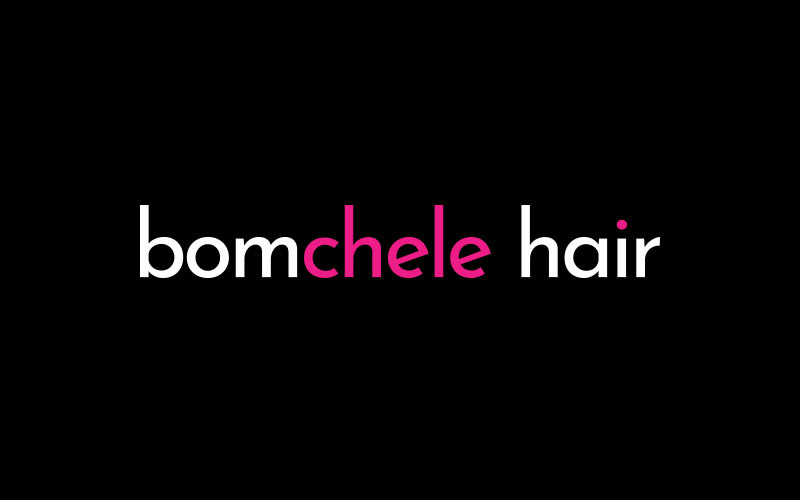
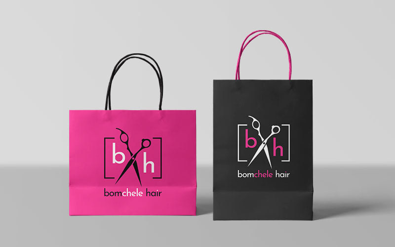
Bomchele Hair is the overarching brand for Professional Hairstylist Michele Twerdun. Venturing out as a solo stylist, Michele wanted a classy and modern logo with a little bit of personality. The slightly angled “e” gives the logo a more playful feel while still being simple, modern, and professional. The colour is focused on the “chele” part of the wordmark, emphasizing that it is a nod to Michele’s name being part of the play on words. The pink dot in the “i” is a nod to it being a one-woman business and also draws a bit of the pink colour into the balance of the logo.
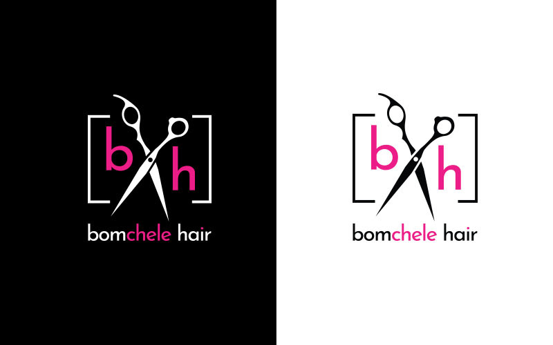
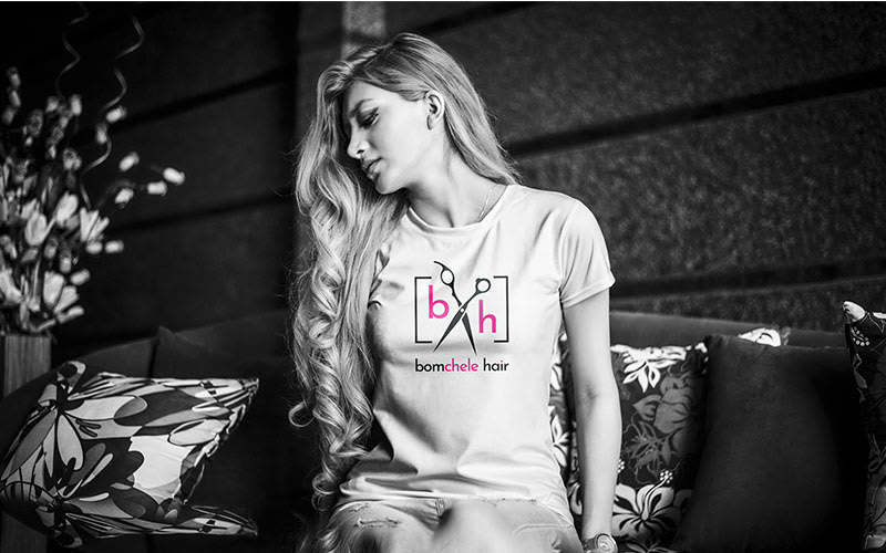
The scissor logo and wordmark combination can be used with or without the wordmark. This use is for social logos and various other branded materials. It provides a relatively gender-neutral feel while still injecting some femininity to appeal to the majority client base.
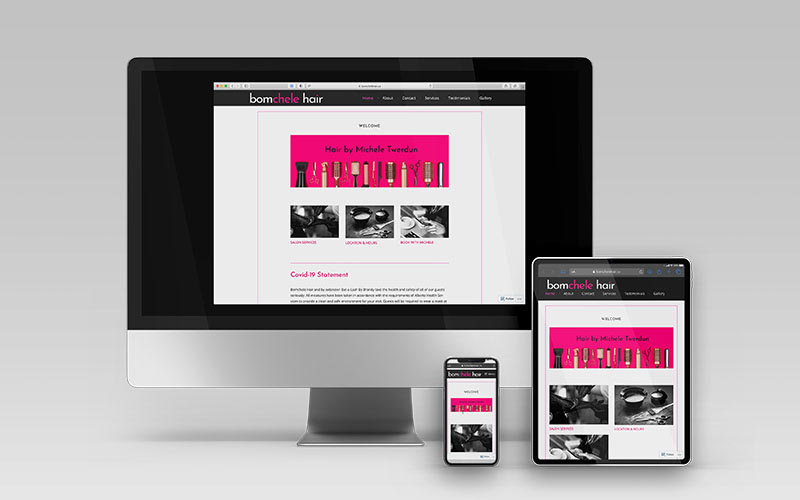
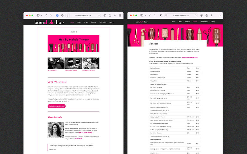
Visit the WordPress website I customized for Bomchele Hair at bomchelehair.ca
Contact me to see more samples of my design work